CaseStudy
TNAA Intranet / Internal websites
Project Name
TNAA Intranet / Internal websites
Client
TNAA (Travel Nurse Across America)
My role in this project
UI UX Designer
Tools used
Sketch, Anima App, Illustrator, Invision, Zeplin
About the Project
Founded in 1999, Travel Nurse Across America (TNAA) is a leading healthcare staffing agency that places travel nurses on assignments in all 50 states. TNAA provides a much-needed service to hospitals that may be understaffed or need to fill vacancies for full-time employees who are taking time off while allowing nurses with a sense of adventure to travel across America and earn a living.
Main Objectives
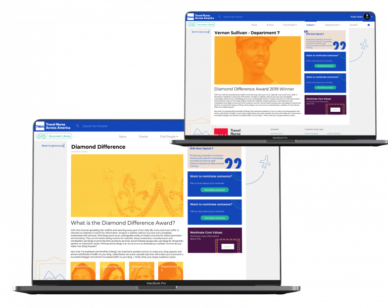
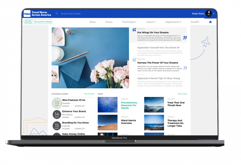
Web Portals, Intranet: “We wanted a sleek, functional design that matched our culture, we foster a ‘family-like’ relationship between our recruiters and nurses and needed to convey and support that with our website.” The design also needed to convey TNAA’s image as a respected, trusted staffing solution.
The Problem
One of the most critical items learned during the research and strategy phases of the project was that excessive points of friction existed throughout all of the processes related to on-boarding new nurses and continuing assignments with existing nurses.
The Solution
Metova designed and developed new experiences for nurses to have more information at their fingertips, streamline the process of applying for new work, and connecting the nurses and the recruiting and support teams directly to provide more transparency and increased efficiency throughout the entire process. Internal recruiting teams at TNAA noted this was previously an area of least efficiency, creating a loss of productivity in nearly a third of their entire day, while nurses expressed frustration with their inability to manage their documents, meet critical deadlines and properly engage with their support team.

Personal Take Aways
The lack of user experience, poor intuitive interfaces and increasing abandonment and disengagement of employees, clients, and final users brought a crucial need to improve all of their platforms. Intranet was a hard project but creating an intuitive flow for new users and attracting them was harder. Yet, by talking and asking different people involved such as current users, new potential ones, and internal employees the findings gave great results.
It is important and a definite must not to forget the user, talking and empathizing with the users creates a bond that will increase the acceptance and embracement of practical and functional software, and becomes a tool facilitating their day to day chores, makes communication fluid, and brings amazing results.
the process
User Personas
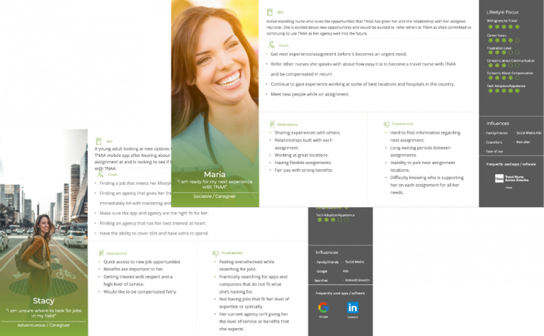
TNAA’s Brand Print information from the Strategy and Planning team translated into several files and information for the design team. We used it to create quite a number of personas for the different products scoped. Some for the Intranet, some others for the web application, new users, current users all to make a 360 experience that could go through their whole company,
Preserving their essence, and connecting them all.

Personas Stories
Using the information of our personas, begun the storytelling, trying to empathize and be familiar with their needs, their day to day basis, their workflow, how the approach their teams, and how they communicate within TNAA and the nurses and viceversa. The probabilities, most common usage and all possible considerations were made, to fulfill and try to make their work lives easier and pleasant.
User Flows
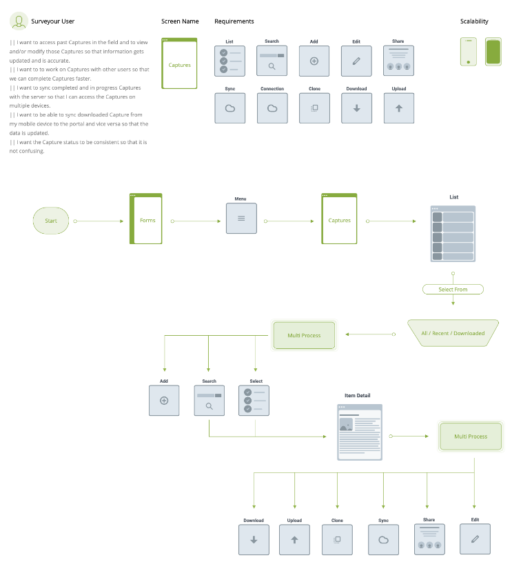
By building up the user flows most of the frictions were identified and with that the possibility to tackle them and finding the best solution became truth. Requirements were clearer and features were possible to prioritize for present and future phases.
Wireframing & UI Guidelines
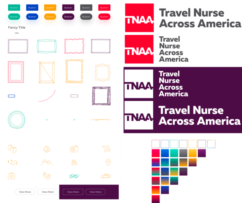
Travel Nurse Across America was very clear of their graphic guidelines, they have hired in the most recent previous years an agency that made this possible for them, so the concrete work in this project in a graphic design way was how to implement their very own guidelines to an User Interface, a few elements were newly added such as buttons and interface controls, but their design was succesfully implemented across the platforms and software worked on.
User interface Design & Prototyping
Using their graphic print and adding a new fresh look was a hard work but successfully integrated the look and feel of the project was very much satisfying, the implementation of trending design and merging that into an interface to make it a little more friendly and the intention of having it serious and corporate but cozy and sketchy was a nice challenge.

User Testing
