
Section I: Executive snapshot
Product
NiMBAL Health, a digital health platform for patients living with Inflammatory Bowel Disease
Industry
Healthcare, chronic condition management
Role
Senior UX Designer
Scope
Full redesign of a live healthcare application, including information architecture, interaction model, onboarding strategy, and visual system
Business objective
Increase usability, emotional trust, and daily engagement without disrupting the existing patient base or violating technical constraints
Core challenge
Redesign a production medical platform
Section II: Business context
NiMBAL Health was already live when the redesign began. The platform allowed IBD patients to log symptoms, communicate with doctors, and manage appointments.
Technically, it worked.
Strategically, it was under pressure.
There were three converging risks:
1. Stakeholder pressure
Leadership knew the product lacked polish and clarity. The experience felt inconsistent and improvised. In healthcare, that erodes trust quickly.
2. User engagement risk
IBD management requires repetitive, daily interaction. When tracking feels tedious or emotionally heavy, patients disengage. Early signals showed user drop-off concerns around routine logging.
In a chronic condition product, disengagement is not a minor UX issue. It directly affects treatment continuity.
3. Competitive pressure
The product competed not only against other digital platforms but against the traditional in-person care model. If virtual tracking feels harder than simply waiting for the next physical appointment, the digital tool loses its advantage.
The initial stakeholder request focused on improving visual design and user experience.
The deeper issue was behavioral friction within a system that required daily commitment.
This was not about aesthetics.
It was about sustaining trust, habit, and medical adherence inside a live healthcare ecosystem.
Section III: Perceived problem vs actual problem
Stakeholders did not approach this as a cosmetic update. They were aware that the experience had structural UX limitations and trusted the design team to propose a stronger foundation.
The primary concern was information architecture.
The app already had active users who understood its structure. Even if the structure was imperfect, it was familiar. A full redesign risked breaking learned behavior patterns.
The perceived problem was:
- The app felt heavy.
- The UI lacked polish.
- Flows were not intuitive.
The actual problem was deeper:
- The information architecture did not guide users clearly toward consistent symptom tracking.
- The system relied on user effort instead of reducing cognitive load.
- A complete overhaul could create transition friction for existing patients managing a chronic condition.
This created a tension:
If we redesigned conservatively, we would preserve familiarity but keep structural flaws.
If we redesigned aggressively, we could improve clarity but risk alienating users who depended on the app daily.
The real challenge was not improving the interface.
It was redesigning the architecture without breaking trust.
Section IV: Constraints and trade-offs
This redesign did not happen in isolation. The product was live, under maintenance, and actively evolving during the design process.
Several constraints shaped the work.
1. Live patient data and continuity
The backend was being partially rebuilt, but active users already had historical symptom logs inside the system.
This created a non-negotiable requirement:
Users could not lose data.
They also could not feel that their past effort was invalidated by the redesign.
The architecture had to improve without breaking continuity.
This influenced navigation structure, data visualization decisions, and the onboarding approach.
2. Parallel development pressure
The application was being maintained and expanded while the redesign was happening.
Design had to:
- Support ongoing development
- Adapt to new features introduced mid-process
- Stay aligned with technical feasibility
This reduced the luxury of long conceptual exploration. Decisions needed to be practical and implementable.
3. Onboarding anxiety
Stakeholders were particularly concerned about onboarding. They feared that a complete structural shift would confuse existing users.
There was pressure to create a comprehensive onboarding experience that explained everything at once.
The trade-off was clear:
A long, information-heavy onboarding might reduce confusion but increase overwhelm.
A lighter onboarding might reduce friction but risk under-communicating change.
The solution required balance rather than completeness.
4. Evolving scope
New features were introduced while the redesign was in progress.
This required the information architecture to be flexible, not rigid. It had to scale without becoming complex again.
Core trade-off
The central trade-off was:
Clarity vs familiarity.
Improve structure too aggressively and risk alienating patients.
Preserve familiarity too much and maintain structural friction.
The design decisions that followed were guided by reducing cognitive load without destabilizing learned behavior.
Section V: Strategic approach and hypotheses
The redesign was guided by a clear principle:
Reduce adaptation friction while improving structural clarity.
Patients using NiMBAL Health were already managing physical discomfort daily. The product could not add cognitive strain on top of that. The strategy focused on three priorities:
- Reduce cognitive load
- Increase emotional reassurance
- Simplify decision hierarchy
Architectural reset
We retained the structural “bones” of the system, including databases and technical foundations, but rebuilt the information architecture entirely.
The redesign process began with behavioral analysis:
- What were users actually doing inside the app?
- Which features were used consistently?
- Which areas created friction?
- What new capabilities were being requested?
We interviewed stakeholders to understand historical user behavior patterns and existing pain points. From there, we restructured the application around usage priority rather than feature inventory.
Instead of organizing around everything the system could do, we organized around what patients needed to do most often.
Core hypotheses
The redesign was built on several working hypotheses:
- If the navigation hierarchy reflects behavioral frequency, daily tracking becomes faster and less mentally taxing.
- If the visual system feels warmer and less clinical, patients perceive the product as supportive rather than transactional.
- If onboarding is progressive rather than exhaustive, existing users adapt without overwhelm.
- If feature prioritization is simplified, decision fatigue decreases during repetitive tasks.
These hypotheses shaped both structural and visual decisions.
Section VI: Key decisions
The redesign was not incremental. The information architecture was rebuilt around behavioral priority.
Below are the decisions that shaped the final structure.
1. Dashboard as orientation anchor
We introduced a dashboard as the primary entry point.
The dashboard served three purposes:
- Provide immediate orientation
- Surface relevant health data above the fold
- Reduce the need to search for core actions
Above the fold, users could see:
- Their health status summary
- Quick tracking entry points
- Immediate feedback loops
This reduced navigation depth for high-frequency actions.
In chronic condition management, reducing one extra tap per day compounds over time.
2. Manual tracking as the primary action
Manual symptom tracking became a dedicated, visible navigation item and a quick-access action from the dashboard.
This reflected actual user behavior. Tracking was the core recurring action. Everything else was secondary.
Instead of forcing users to navigate through nested menus, tracking was always one tap away.
This simplified the decision hierarchy:
Track first. Explore later.
3. Five-item navigation structure
The final architecture consolidated the product into five primary navigation items.
The goal was clarity, not feature exposure.
Rather than listing every capability, we grouped features logically:
- Dashboard
- Tracking
- Knowledge base
- Medical advisor access
- Additional structured utilities
This avoided menu sprawl while keeping the system scalable.
4. Progressive onboarding instead of exhaustive onboarding
Stakeholders initially leaned toward a comprehensive onboarding to explain the redesign.
We deliberately split onboarding into progressive moments.
Instead of overwhelming users with a full system walkthrough, we introduced contextual guidance as they interacted with new areas.
This reduced anxiety during transition and respected returning users’ familiarity.
5. Emotional tone shift in UI
The previous experience felt clinical and heavy.
The new UI system introduced:
- Warmer color palettes
- Softer visual hierarchy
- Modern spacing and typography
- Reduced visual density
The goal was not decoration. It was emotional calibration.
When a user logs symptoms daily, the interface tone influences perception of effort.
A sterile interface reinforces illness.
A supportive interface reduces psychological burden.
6. Messaging deprioritized as a core behavior
While doctor communication and community interaction remained available, they were not positioned as primary navigation anchors.
Usage patterns showed that daily tracking was the dominant behavior.
Messaging became supportive, not central.
This prevented feature competition in the main hierarchy.
Section VII: Evidence and outcomes
The redesigned experience shipped to production after iterative validation cycles.
Due to healthcare sensitivity and operational constraints, validation was conducted primarily through structured remote reviews and A B comparison sessions with stakeholders who had deep familiarity with user behavior patterns.
Validation focused on:
- Navigation clarity
- Onboarding comprehension
- Tracking accessibility
- Visual tone alignment
Rather than testing visual preference, sessions evaluated:
- How quickly stakeholders could locate core actions
- Whether the new hierarchy reduced ambiguity
- Whether the onboarding felt overwhelming or paced
Iteration was continuous.
Certain architectural changes met immediate alignment. Others required negotiation, particularly around onboarding depth and feature prominence.
The most consistent validation signal was this:
The new structure made tracking and orientation faster to understand at first glance.
The dashboard reduced search behavior.
The progressive onboarding reduced anxiety about change.
The warmer UI tone was perceived as more supportive and less clinical.
While quantitative patient metrics remain confidential, the redesign was approved for production rollout and integrated into the live system.
In a healthcare context, deployment approval itself reflects risk confidence.
Section VIII: Organizational impact
The redesign extended beyond interface improvements.
1. Scalability preparation
The new information architecture was designed to support future expansion.
Several new features were defined and built after the redesign. Others were intentionally not built, but the architecture was structured to accommodate them without structural disruption.
The system was prepared to scale not only within the app but across connected applications within the ecosystem.
This shifted the product from reactive feature accumulation to modular growth.
2. Onboarding governance
Onboarding became a recurring strategic discussion with stakeholders.
There was tension between:
- Extreme specificity, especially in medical measurement inputs
- Overloaded screens attempting to capture too much at once
Initial requests included dense, multi-question screens that would have created cognitive overload.
Through iteration, we structured questionnaire flows into clearer, segmented interactions.
Instead of asking everything at once, we separated information logically and introduced pacing to reduce overwhelm.
This reframed onboarding from “information dumping” to structured behavioral guidance.
3. Component reusability
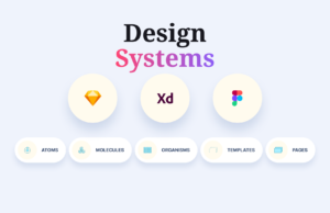
Although a formal design system did not exist, the redesign followed an atomic component approach.
Reusable components were built to support:
- Tracking inputs
- Data summaries
- Advisor access modules
- Educational content blocks
The system adhered to established standards at the time, including WCAG accessibility guidelines, Material principles, and native iOS patterns.
This created consistency and reduced design entropy as the product expanded.


No comment yet, add your voice below!