
Name
Econocheck – Club Checking App
My role in the project
UX Designer
Tools used
Sketch, Illustrator, Photoshop
About the Project
Econocheck is a leader in the financial services enhancement market. They are known for the outstanding
client service and customer service. Improving the experience on their full powered mobile application will
bring their clients and their customers a better satisfaction by receiving their benefits right on their hand.
Main Objectives
Delivering a more personalized app experience based on their Customer Persona, in order to better surface
and feature those core services, may provide additional benefit and usage.
The Problem
The categories where Econocheck is strong in feature/services coverage:
Discounts & Rewards
Concierge Services
Insurance & Protection
Health & Wellness
The categories where Econocheck is weak in feature/services coverage:
Privacy & Security
Credit Monitoring
Device Security
One competitor is the only competitor delivering a personalized UX/UI for users based on implicit and explicit
app usage data.
The Solution
Invest in Privacy & Security features which rank high in desire from our Customer Research results.
Develop a more personalized application experience for users, which is currently delivered by only one
competitor
Build a more robust alerts and notifications experience as this is a clear gap between Econocheck and
competitors.
Create a new-user onboarding experience which seeds the personalization from the initial use of the
application.
Personal Take Aways
This project started as “we need just a redesign” after the consideration of the variables of the project client
went all for it and the initial thought became into an enhancement of the all over user experience giving client
and users a better perspective, fresh look and growth capabilities beyond expectations.
Sometimes clients begin with the idea of changing a few colors and improving the user interface, yet with the
help of improving user experience and the strength provided by user research is easier for them to realize the
importance not only for the project but also for the actual future of the company.
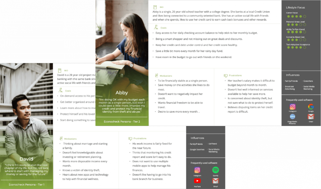
THE PROCESSUSER PERSONAS
Final users of bank appliacations is a major challenge, now. Think about an
application that should work for different bank companies, not only individuals
members of a bank present several distinctions amongst each other, but they all
feel their bank is the best option for some reason. Imagine now, making that for
several other financial institutions could potentially and easily become a
nightmare.
Therefore, along the client, and many surveys interviews, research and strategy
came to the design team with a number of tiers that we focused on.
Their needs, goals, tech knowledge, motivations, frustrations, influences, and
lifestyle priorities became kind of our religion. Put yourself in the shoes of others
was the mantra at every meeting or project thought.
PERSONAS STORIES
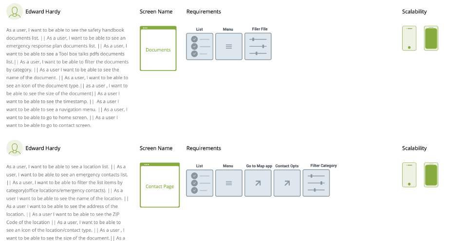
Becoming these people had whose had their very specific needs, lead us into their
stories and all the what if’s became As “a user” I want to, need to, and so on.
Technical Requirements were part of these insights and to match business needs
was also part of it at all times.
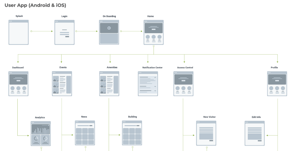
USER FLOWS
They say all paths go to Rome, in user experience we know it is not that much of a
truth, some of them may take you somewhere you did not expect or wanted to,
but walking these paths with the shoes of the user, made us think how to make
those places that aren’t Rome a nice place to visit and take back the right route.
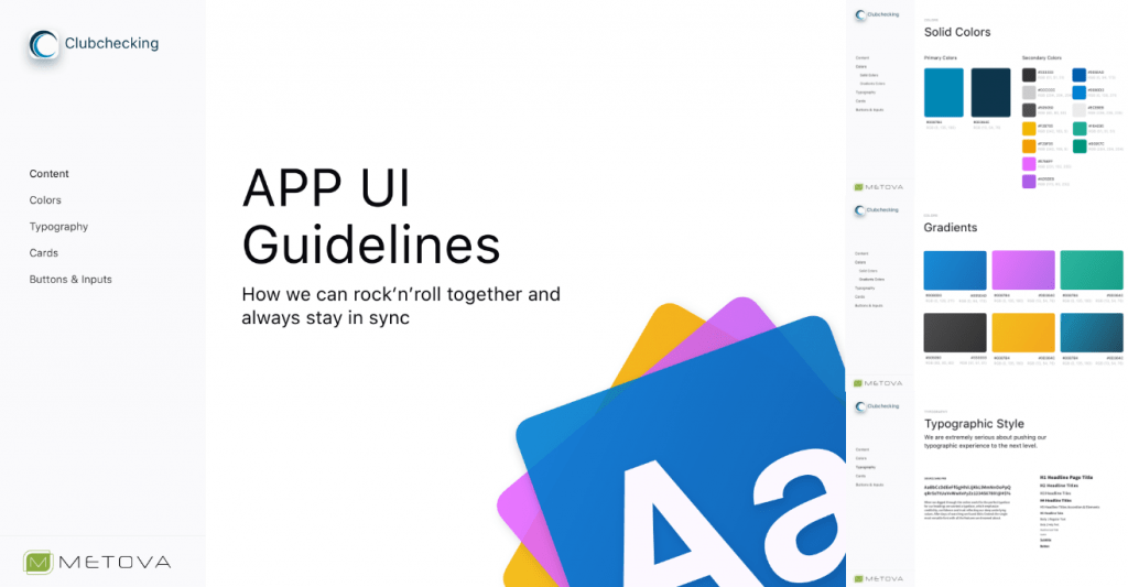
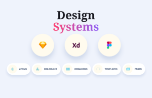
WIREFRAMING & UI GUIDELINES
Building up the skeleton and establishing the UI elements was the next step. Club
Checking app is a powerful tool not only because it has too many options and
features, but also because its chameleon ability it should be able to transform
itself into a whole different application, and choosing a color scheme was not an
easy task. While the layout had to be readable, hierarchically clear and absolute
functional the interface had other standards to meet. Building an understandable
Design System made it into the conversation, and the purpose of it was talked.
Basic principles of Design Systems were the chosen option to start with and so it
was built.
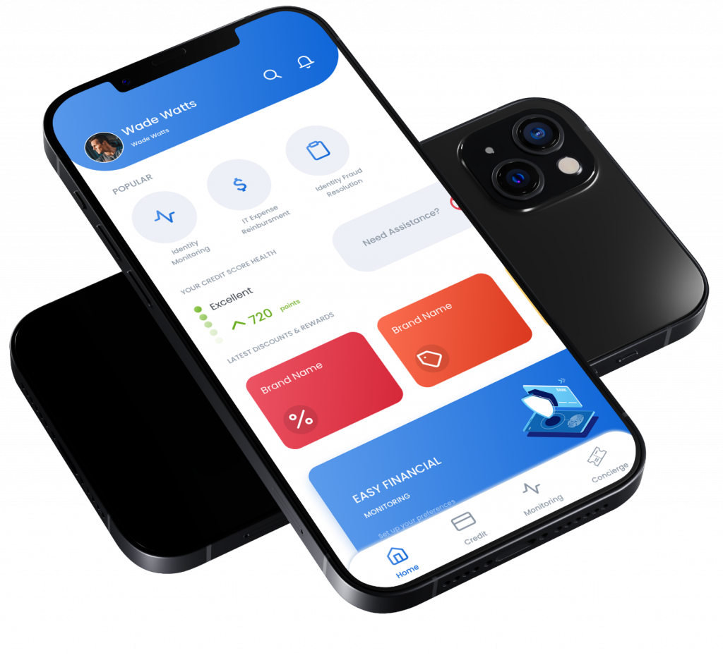
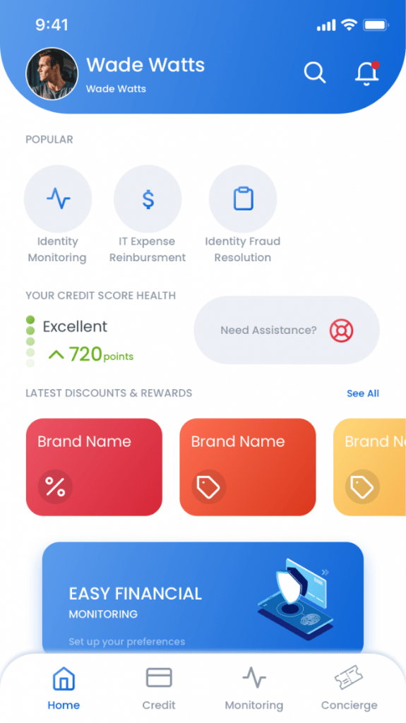
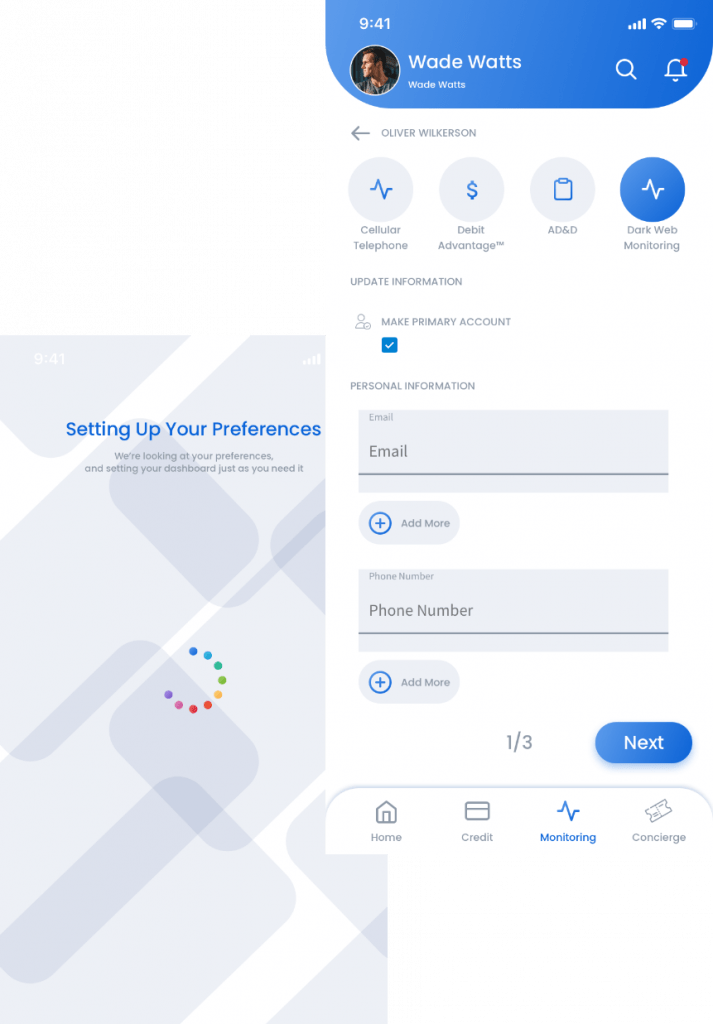
USER INTERFACE DESIGN & PROTOTYPING
A fresh, colorful, friendly and intuitive application clean interfaces, visible features,
modern interactions, easy to understand, and relatable information for current and
new users, was the final result. Exploration of several designs, trends, exponential
growth were part of the final product.


No comment yet, add your voice below!